VisitER is designed to enhance ER visiting experience by increasing patients' awareness of their wait status and streamlining the communication with the hospital staff.
Under the circumstances of master-level UX fundamental course project whose theme is:
Improving the citizenship experiences of people of Toronto.
My main responsibilities in the project:

Secondary research, survey & interview design, and report delivery

Usability testing and issues evaluations

Presentation structure, lo-fi wireframes, and medium-fidelity prototypes

When discussing the concept of citizenship in Toronto, a prominent thought often centers on the experience of visiting Emergency Rooms (ERs). These visits are commonly associated with lengthy waits, tension, anxiety, and a sense of helplessness. To gain a deeper insight into this critical area, we have undertaken comprehensive secondary and primary research. This research focuses on the current state and prevailing challenges of ER visits, with an overarching aim to significantly improve the patient experience.
To emphasize with patients about their thoughts and feeling of visiting ERs and figure out their true pain points are, primary research is conducted through interview and survey.
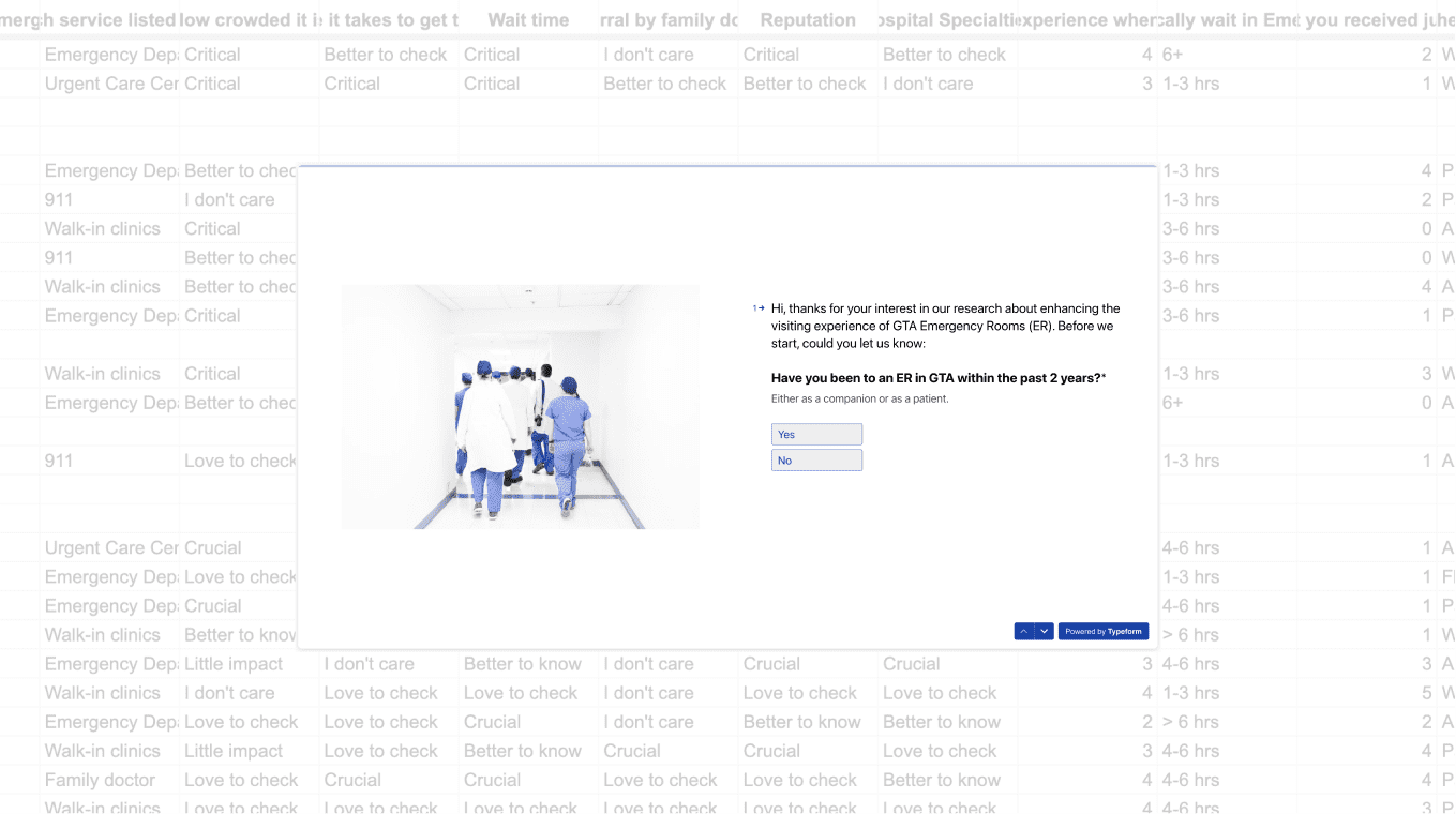
Survey is sent out to the general public on social media and the respondents will be screened by the first question that asks if they have been to a ER in GTA in the past 2 years.
Interviewees are recruited through our personal network of classmates and friends who do not have close relationship with us. Only those who have been to an ER in GTA in the past 2 years have been invited.
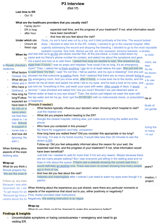
The raw data from interviews are categorized in the affinity map for critical insights.
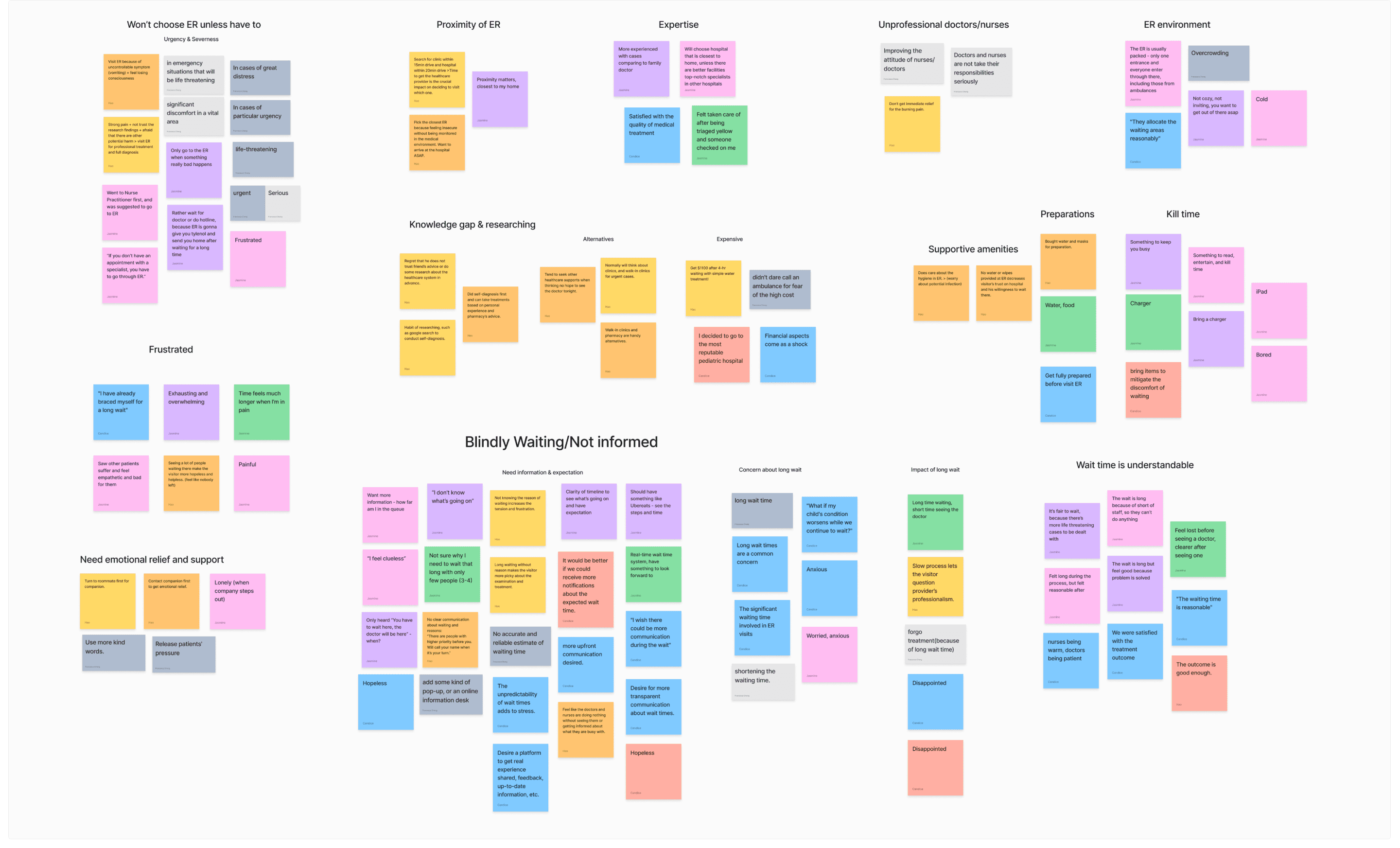
The raw data from interviews are categorized in the affinity map for critical insights.
The current state of the Emergency Room (ER) has primarily focused on managing patient emergencies, providing timely medical care, and ensuring patient safety. What the existing product/service fails to address is to effectively communicate with patients, leaving them feeling like they haven't received timely care during their ER visit and lacking the necessary information to make informed decisions and engage fully in their healthcare experience.
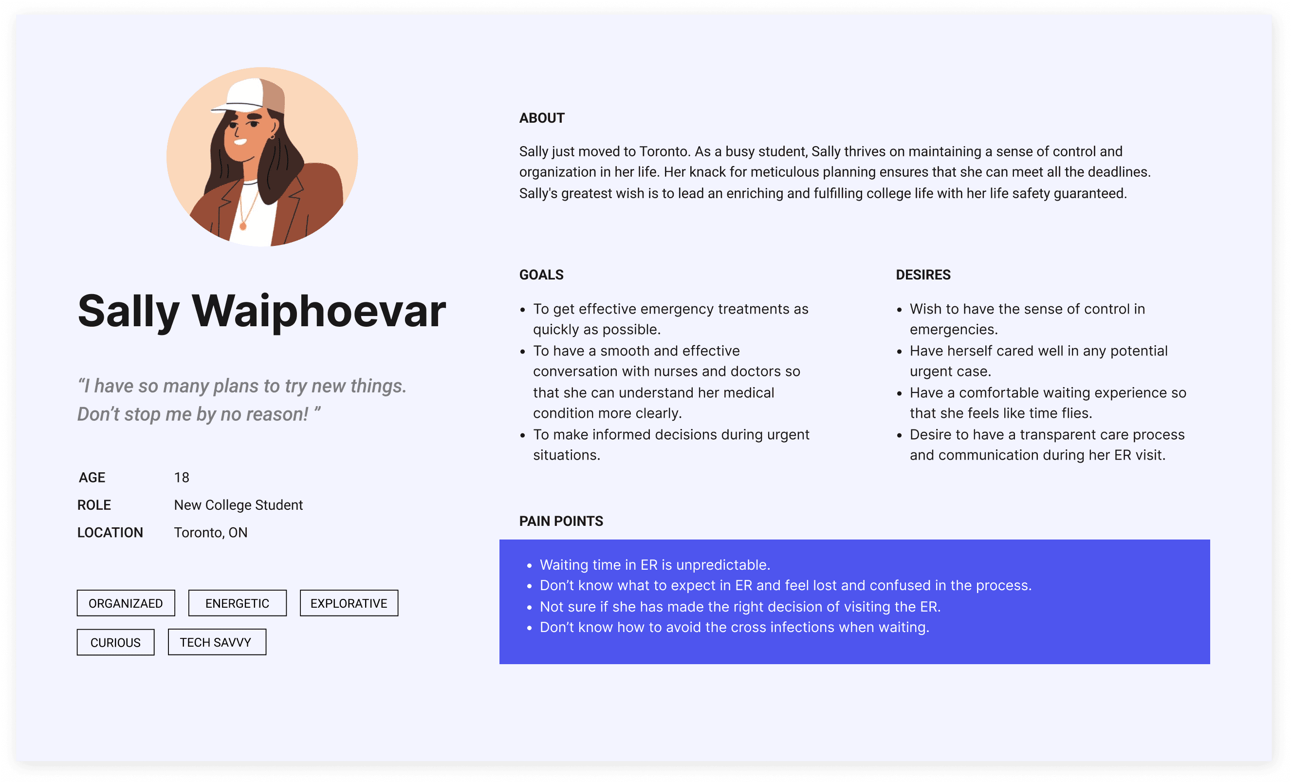
Knowing the general problems in ER visits, we have our persona, Sally Waiphoever, as the representative user, for whom we are going to dig deep into the mindset and possible solutions to relieve Sally’s pain points.

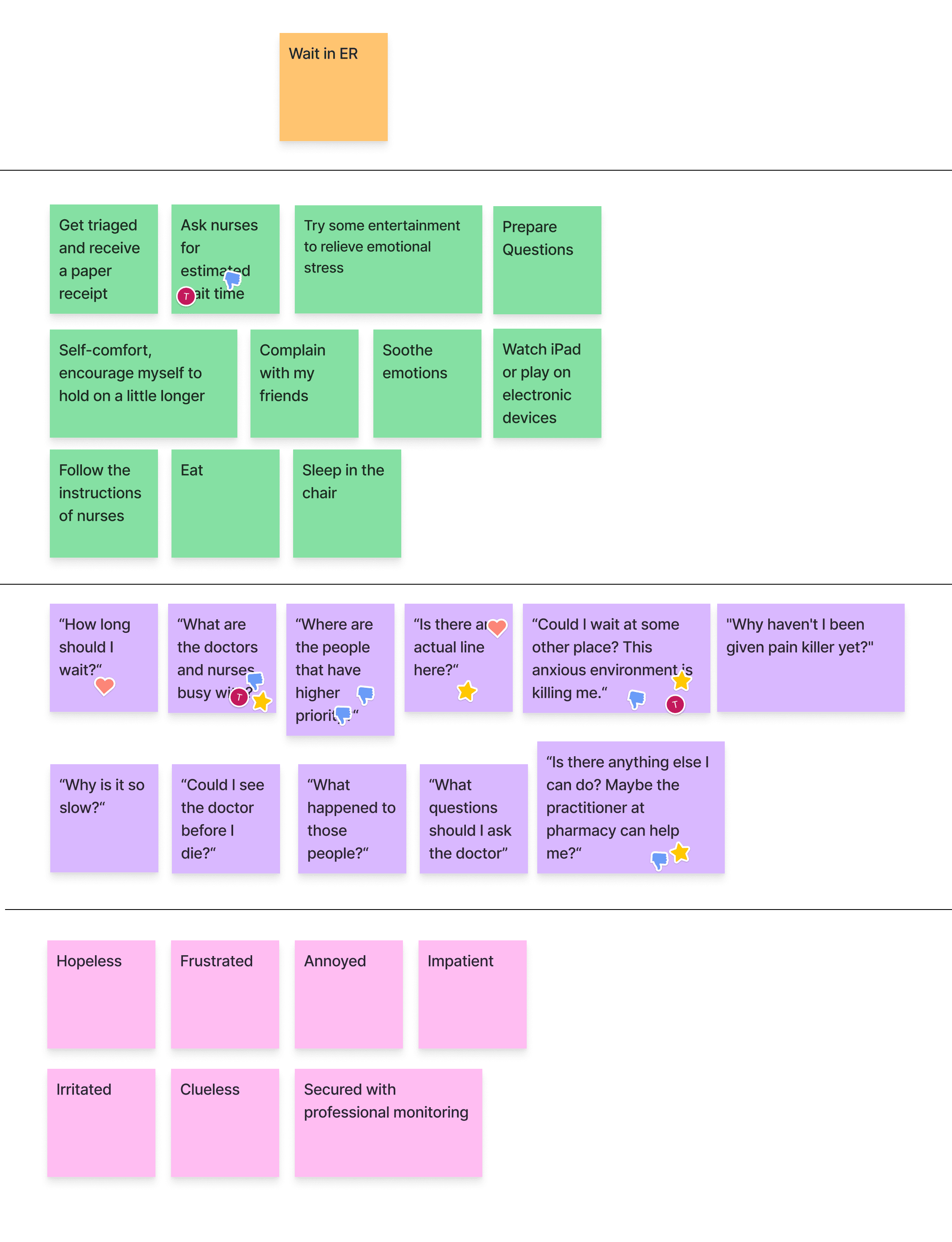
Based on our well-rounded understandings of Sally, we walk through the scenarios of her visiting the ER and vote on the painful moments, through which we can identify the issues most needed to be addressed through our design.
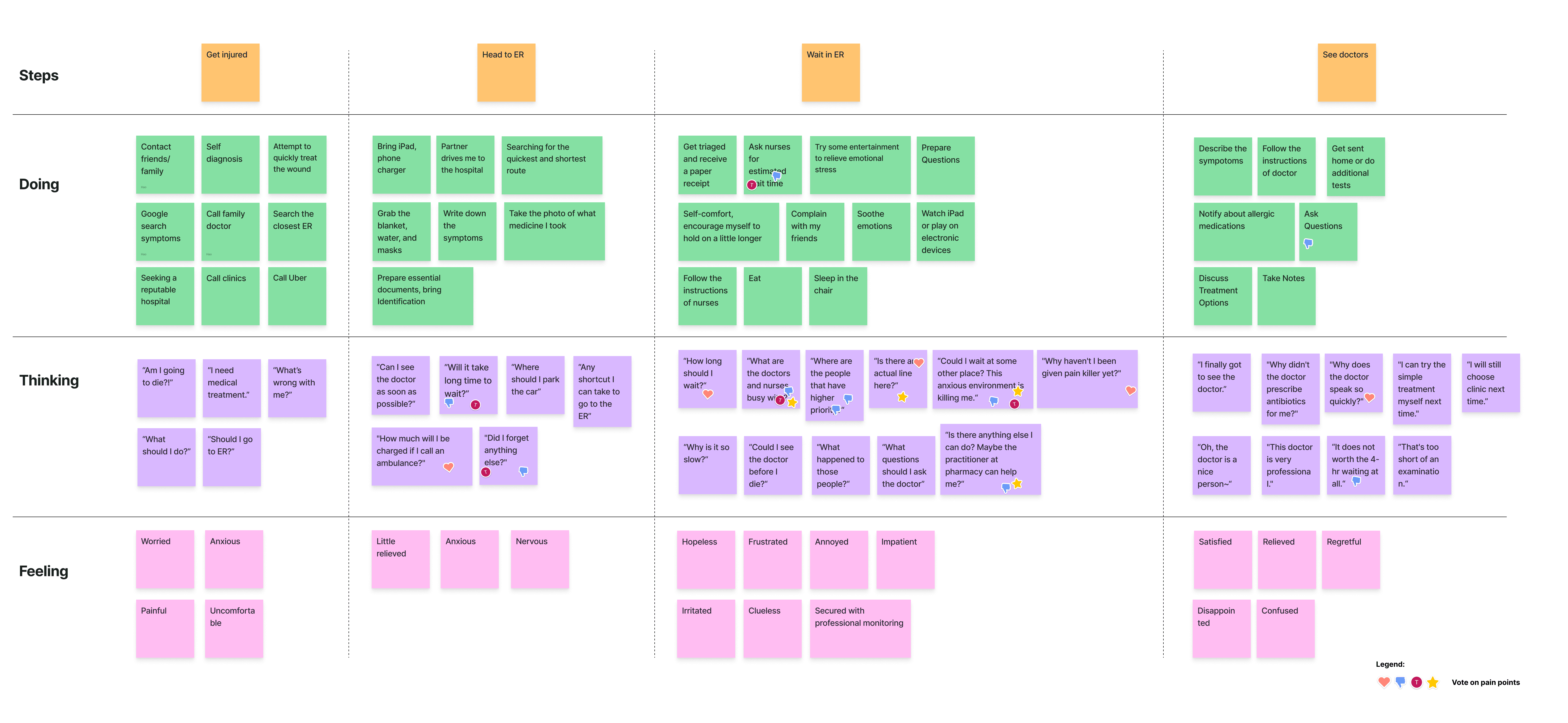
Through the voting results, we can find that the most of painful moments are in the stage of waiting in ER.
Knowing the general problem space and the specific pain points Sally has during visiting the ER, we craft the objective first as guideline for later solution design.
Our project will address this gap by implementing a comprehensive communication and information system that empowers patients to:
With the big objectives in mind, we create the needs statement for directional inspirations of enablement we would like to provide to users through our solution design.
Aiming to meet the needs, we brainstorm various ideas and vote on its impact and feasibility for prioritization.
Considering the limits of healthcare industry, we have hypothesized the following two assumptions for a promising improved future of ER visit.
The ideas that have high feasibility in term of scope and technical requirements while performing well in bring values to the industry and society (high impact) tend to be selected.
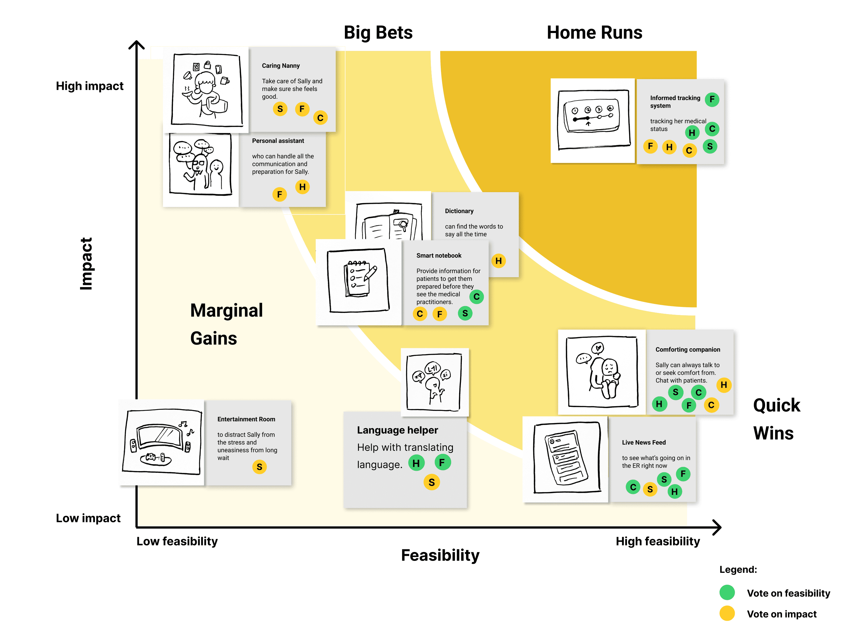
Considering the timeline and guided by our prioritization grid, we have selected the following ideas to continue developing.
With amazing ideas selected, we set up goals for us to narrow down the focus and move forward towards the envisioned future of ER visitors.
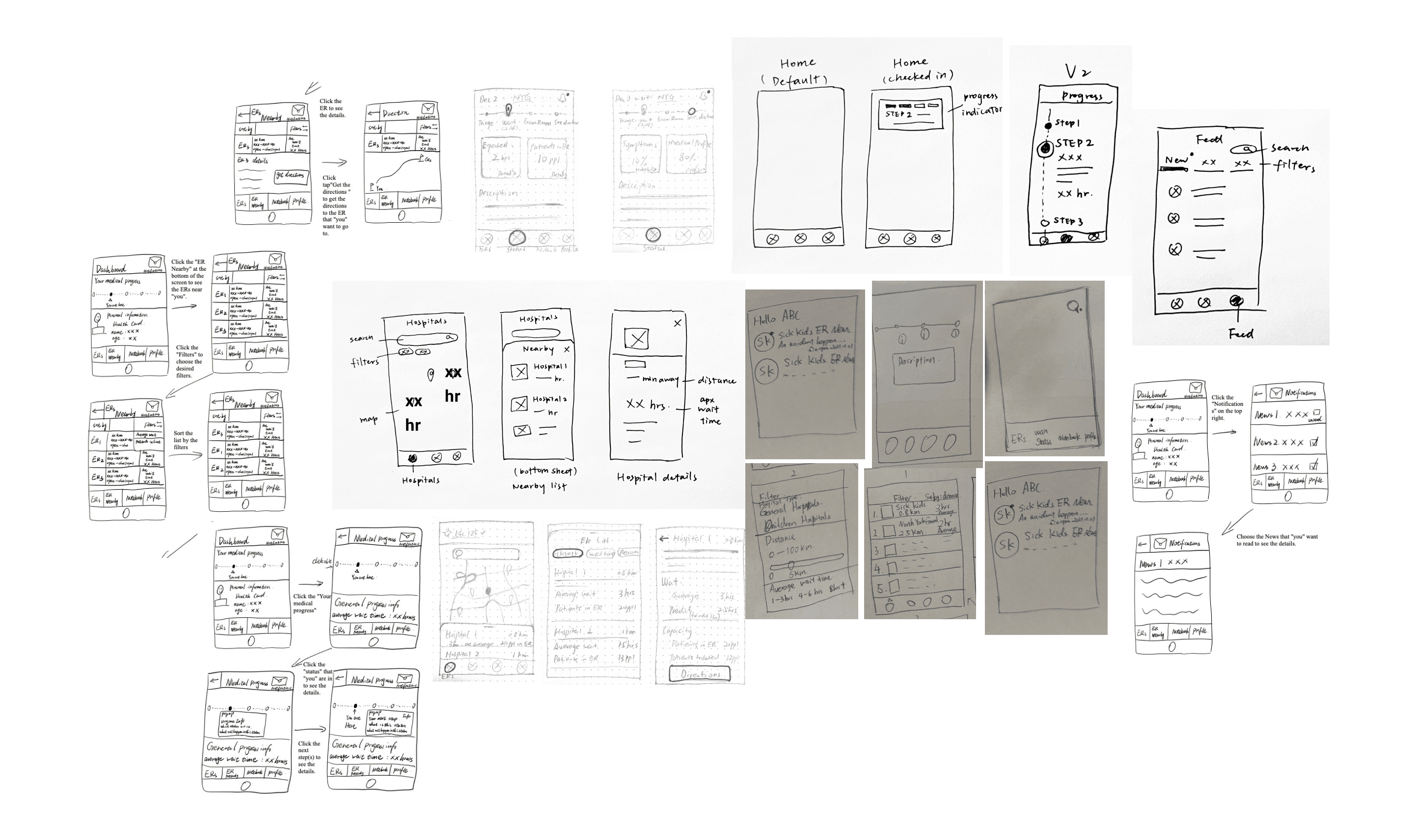
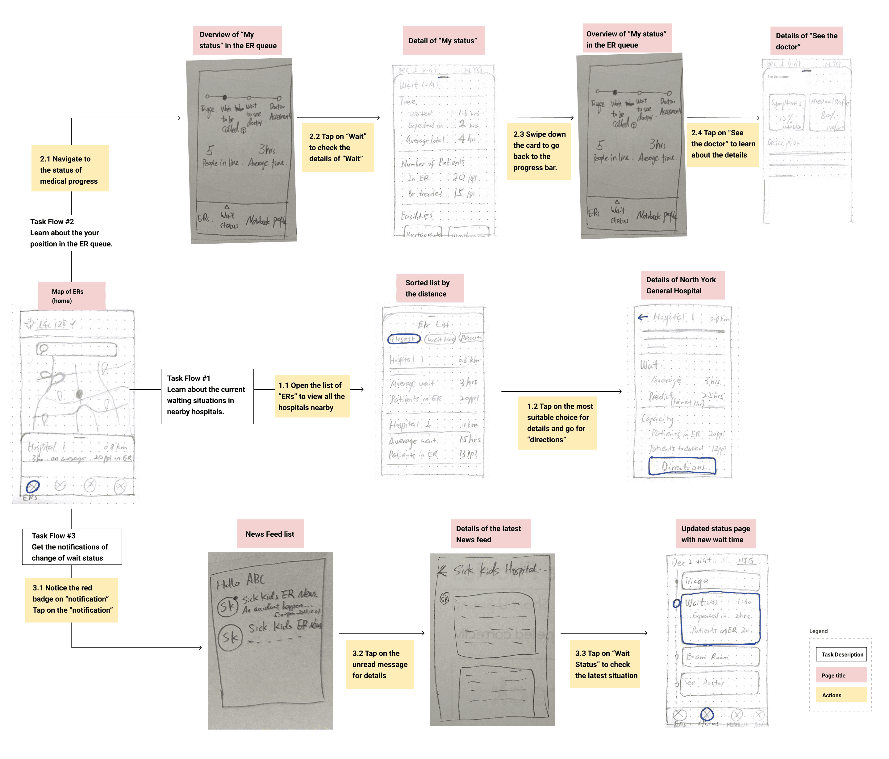
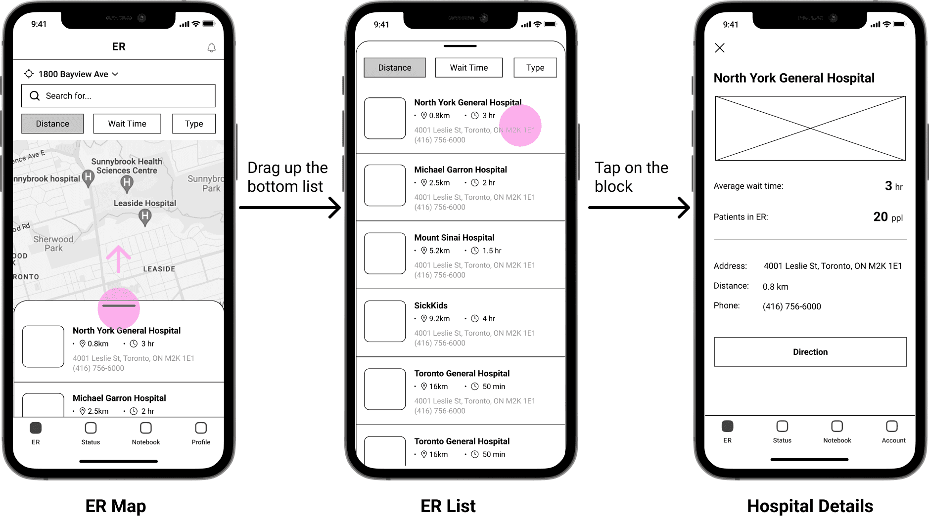
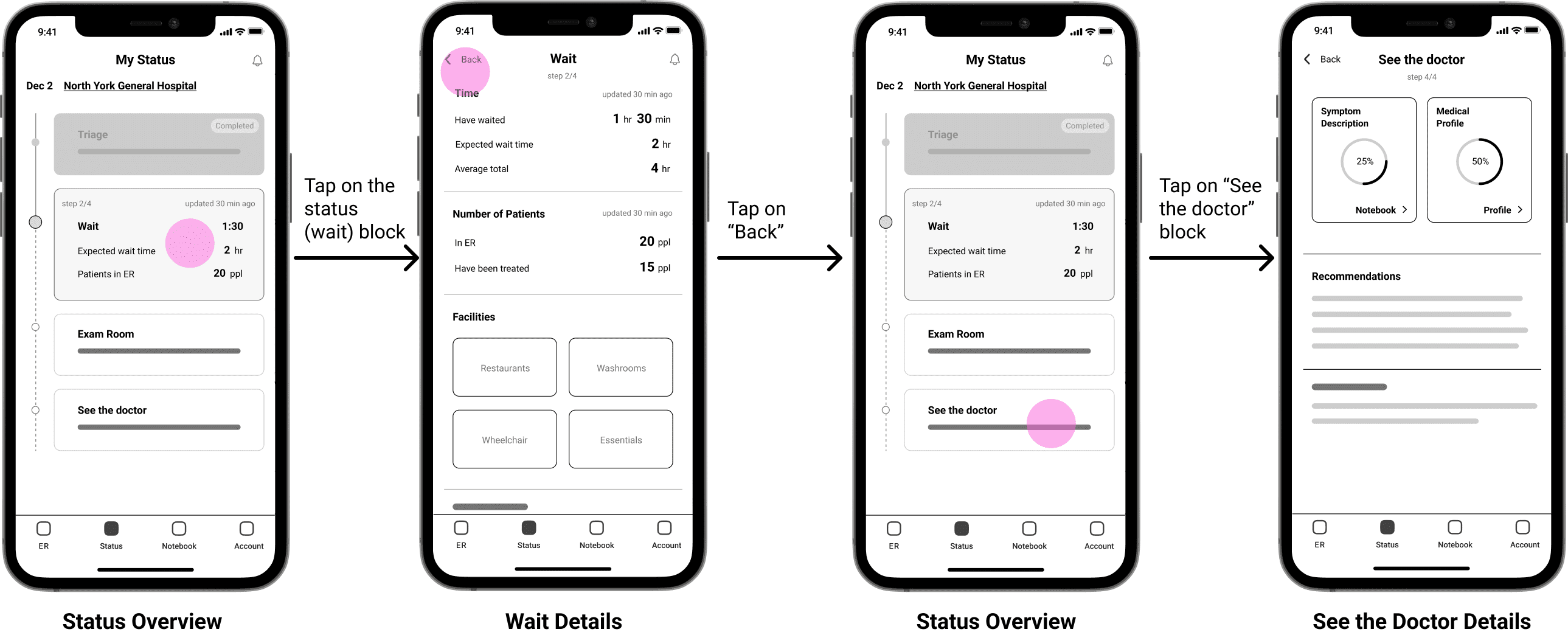
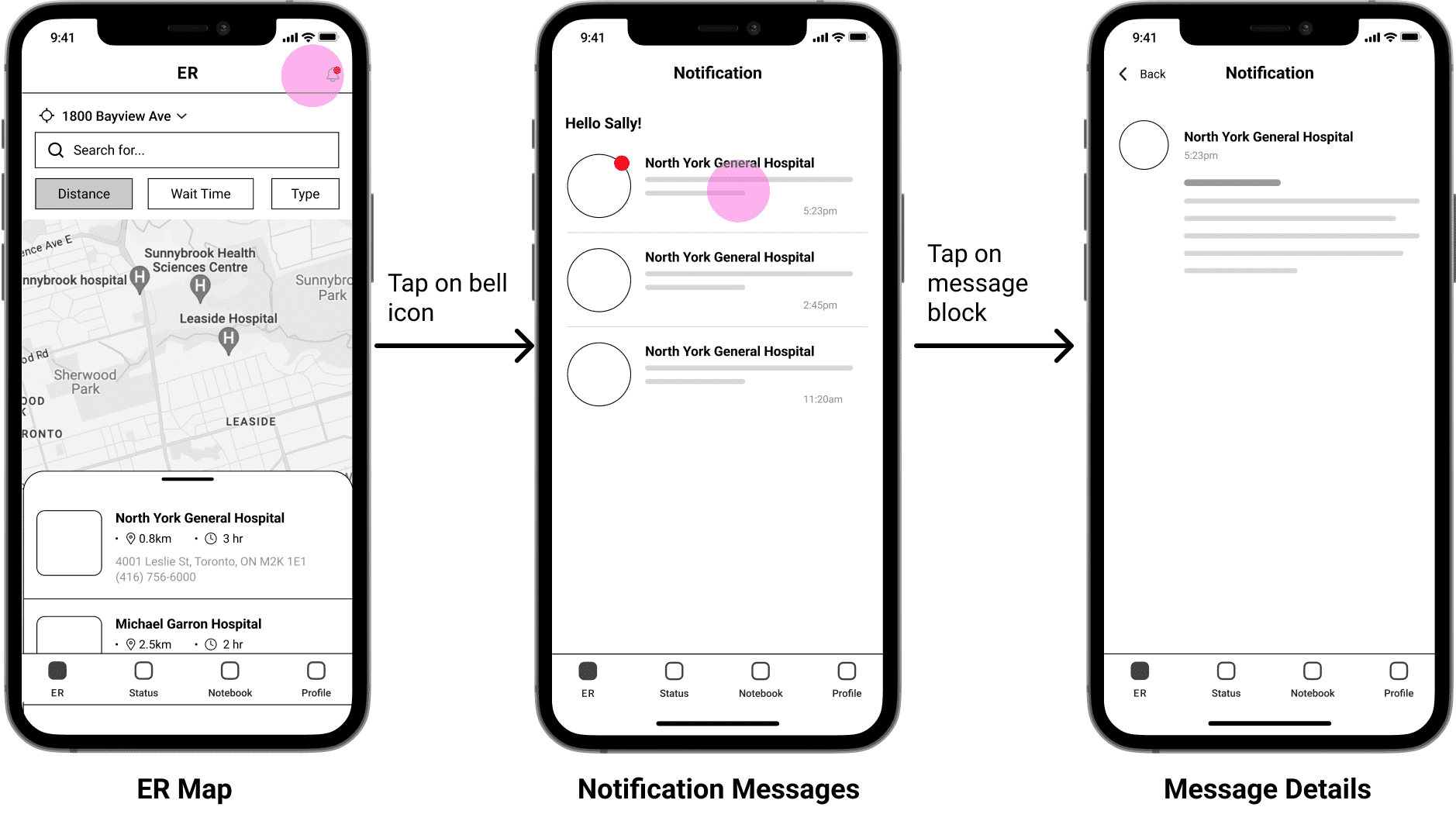
Setting up the core tasks we would like the initial solutions to realize, we combine our sketches in the order of task flows to validate its feasibility with representative users.
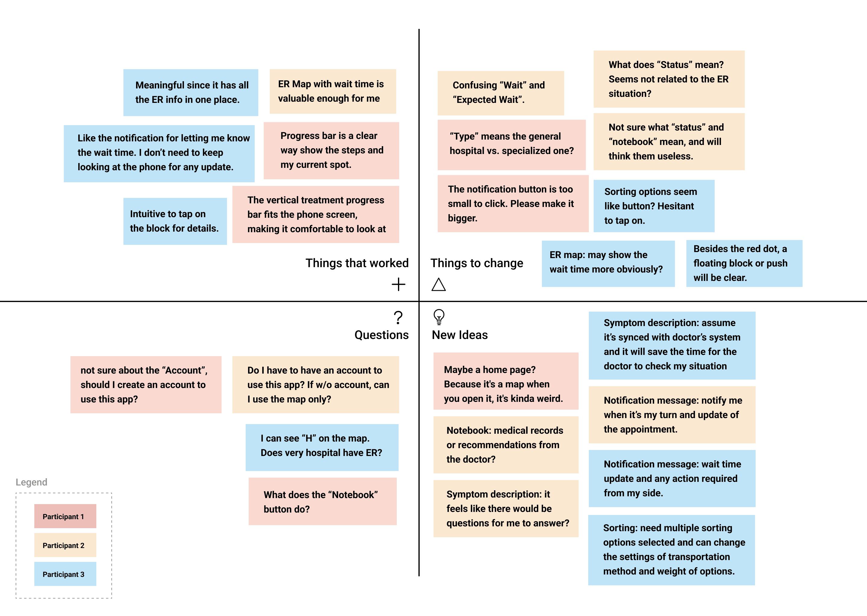
We have walk 3 representative users through our lo-fi wireframes on paper and ask for their feedbacks, and we get the key findings as below:
With the feedbacks from lean evaluation involved, we detail our designs to medium fidelity. To develop further and create a more immersive experience for representative users to go through, we connect the wireframes and add proper effect and motion designs.
To validate our revised solution’s feasibility, a formal round of evaluation and usability testing is conducted through observing and interviewing. Three representative users who is between 18 and 50 years old are invited to this session.

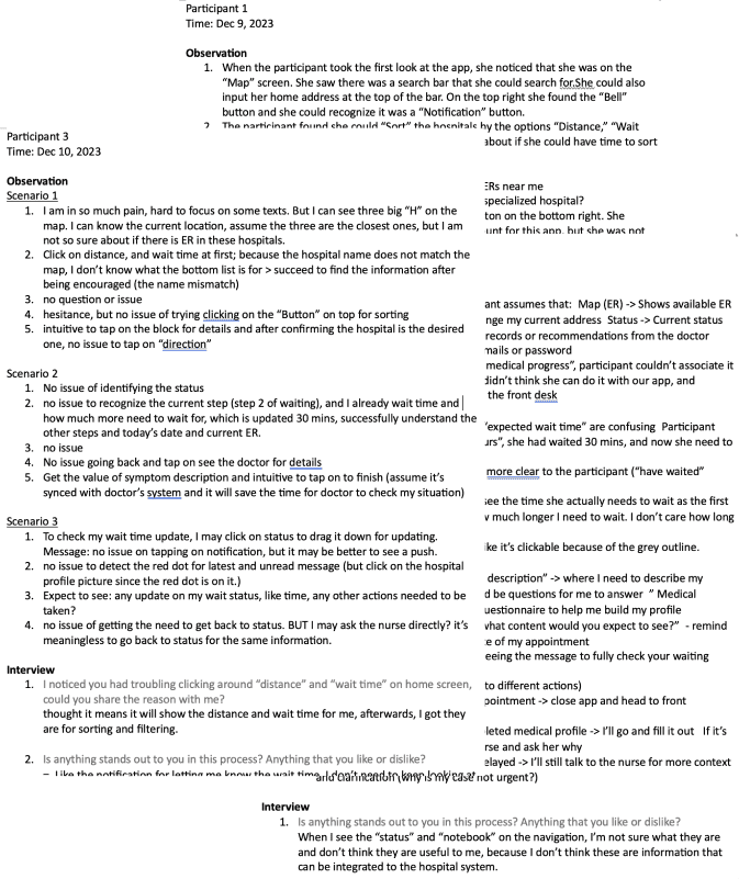
Based on the evaluation analysis, critical issues are highlighted in sections of the “things to change” and “questions”, which will cause confusion and affect users going through the three basic functions to be aware fo their wait status. This would mainly include icon size, labeling, and component design, based on which we will revise our design as the first step accordingly.
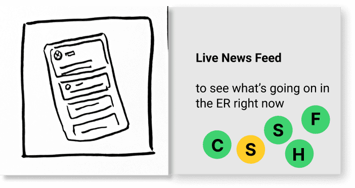
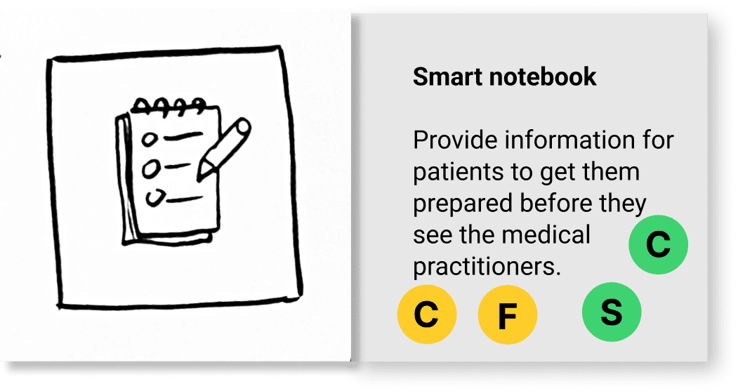
Inspired by the “new ideas”, such as having notebook synced with doctor’s system, we will involve new futures while maintaining the solid base of “things that work”.